Create an app | Access Web AppBuilder from Map Viewer, Scene Viewer, View item details, or the My Content tab of the content page. | |
Choose a theme | Configure the look and feel of the app by choosing a theme. A theme includes a collection of panels, styles, layouts, and preconfigured widgets. | |
Select a map or scene | Select a map or a scene you’ve created or choose one from your organization. If you open Web AppBuilder from Map Viewer or Scene Viewer, you’ll already have a map or scene selected, but you can change it. | |
Add widgets | Widgets give your app functionality, such as the ability to print an overview map. Each theme has its own preconfigured set of widgets, and you can add more. | |
Configure attributes | Attributes allow you to customize your app banner with a logo, title, hyperlinks, and so on. | |
Preview, save, and open | You can preview your app with popular device screen sizes (2D apps only). When you’ve completed the previous steps, save and open your new app. |
Content in this section was adapted from “Create Apps: Make Your First Web App” (ArcGIS.com)
A theme is a template framework representing the look and feel of an app. Content in a theme includes a collection of panels, styles, and layouts, and a set of preconfigured theme widgets. An app can include more than one theme, but it can only use one theme while running.
Content in this section was adapted from “Create Apps: Themes” (ArcGIS.com)

| Theme Name | Theme Description |
| Billboard | For apps with simple tasks. It has the most layouts of all the themes and does not display the logo, links, and widget controller. All the widgets in the theme are on-screen widgets. |
| Box | Focuses on the widgets in the widget controller. By default, all on-screen widgets are turned off. There are no placeholders for widgets and no logo or links display. It is for apps that require a clean look on the map. |
| Dart | Widgets in the widget controller display as placeholder widgets. You can have multiple widgets open and move them around. By default, all on-screen widgets are turned off. Similar to the Box theme, there are no placeholders for widgets and no logo or links display. |
| Dashboard | All the widgets in the panel open simultaneously when the app starts. It is designed to visualize widgets and their communication directly. You can modify the predefined layout by adding or removing grids, or resizing the grids in the panel. By default, most on-screen widgets are turned off except the Home, Zoom Slider, and Full Screen widgets. Optionally, you can turn on the Header widget to display the logo, the app name, and links. |
| Foldable | All the widgets in the panel open simultaneously when the app starts. It is designed to visualize widgets and their communication directly. You can modify the predefined layout by adding or removing grids, or resizing the grids in the panel. By default, most on-screen widgets are turned off except the Home, Zoom Slider, and Full Screen widgets. Optionally, you can turn on the Header widget to display the logo, the app name, and links. |
| Jewelry Box | Evolved from the Foldable theme with a focused widget on the left of the app. It is for apps with a workflow task. |
| Launchpad | For users who prefer the Apple Mac style. It allows you to open multiple widgets, and move, resize, and minimize them. |
| Plateau | Can be used to create a modern and basic app with flat toolbars and widget containers. |
| For apps that will be embedded in websites, story maps, or other locations with surrounding context. Only one widget is supported in a panel that can be positioned on the left or the right. | |
| Tab | As with the Foldable theme, it supports all widget types and can be used for apps with complicated tasks. |
Content in this section was adapted from “Create Apps: Themes” (ArcGIS.com)
Available styles vary depending on the theme selected. Most themes have seven predefined colors from which to choose, except the Launchpad and Dashboard themes. If your organization has defined the shared theme with a header color, it will be the default color when an app is created.
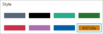
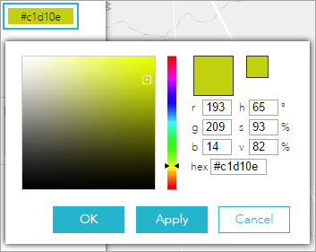
You can also choose your own color by clicking the last color in the color picker.
Content in this section was adapted from “Create Apps: Themes” (ArcGIS.com)
A layout represents a preset placement of user interface items.
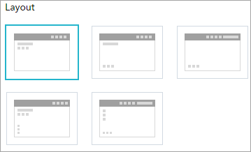
Only the Dashboard theme allows you to modify and generate your own layout.
When you build 2D apps, the available layouts vary depending on the theme selected. In addition, there are two styles of layout. One is for desktop and one is for mobile devices. When either the height or width of a screen display is less than 600 pixels, the mobile layout applies.
When you build 3D apps, each theme has two layouts for desktop only.
Content in this section was adapted from “Create Apps: Themes” (ArcGIS.com)
| ||
| The About widget creates content that displays in the widget. | |
| The Basemap Gallery widget presents a gallery of basemaps and allows you to select one from the gallery as the basemap for your app. | |
| The Chart widget displays quantitative attributes from an operational layer as a graphical representation of data. It allows end users to observe possible patterns and trends out of raw data. | |
 | The Coordinate widget displays x- and y-coordinate values on the map. With the default coordinate system of the web map, the coordinate values change dynamically when the mouse pointer moves to locations on the map. Multiple spatial references can be configured and the coordinate values display based on the spatial reference you choose when the application starts. | |
| The Distance and Direction widget allows you to draw lines, circles, ellipses, and range rings to visualize important information. | |
| The Draw widget allows you to draw simple graphics and text on the map. You can also use it to add line distance or polygon area to the feature as text. | |
| The Extent Navigate widget allows you to navigate the map to its previous or next extent. | |
| The Filter widget allows you to limit the visibility of features in a layer. Only the features that meet the expression criteria will be visible in the map. Accordingly, other out-of-the-box widgets, if applicable, will respond to the change it makes in the layer. | |
| The Group Filter widget allows you to apply a filter on the map based on one or more layers in the map. A set of layers are grouped into a logical filter set. Each set can have a predefined value to facilitate user interaction. This widget has two modes: normal, which allows the building of complex filters during run time, and simple, which only allows one filter to be applied. | |
| The Home Button widget zooms the map to the initial map extent. | |
| The Infographic widget provides 16 graphic templates you can use to visualize and monitor attributes and statistical data in the map and from extra data sources. | |
| The Info Summary widget allows you to provide a count of features in the current map extent for each layer specified. Each layer in the widget panel can be expanded to show a list of features in the current extent, optionally grouped by a specified field. Point layers in the widget can be configured to display as clusters. | |
| The Layer List widget provides a list of operational layers and their symbols, and allows you to turn individual layers on and off. Each layer in the list has a check box that allows you to control its visibility. Some layers contain sublayers or subtypes. | |
| The Legend widget displays labels and symbols for layers in the map. It supports dynamic, tiled, image, feature, and KML layer types as well as WMS layers with an associated legend URL. The Legend widget can be set to automatically update when the visibility of a layer or sublayer changes. When no operational layers are rendered in the map, the Legend widget is blank. | |
| The Overview Map widget displays the current extent of the map within the context of a larger area and updates whenever the map extent changes. The current extent of the map is represented in the overview map as a gray rectangle that can be dragged to modify the extent of the current view. You can expand or fold the widget. When the widget is expanded, you can also maximize or minimize it. | |
| The Print widget connects the web app with a printing service to allow the current map to print. | |
| The Scalebar widget displays a scale bar on the map. The widget respects various coordinate systems and displays units in English or metric values. When working with Web Mercator or geographic coordinate systems, the scale bar takes into account projection distortion and dynamically adjusts. | |
| The Search widget enables end users to find locations or search features on the map. By default, the widget uses the geocoding service from your organization or portal and displays searchable layers configured in the map, if available | |
| The Share widget allows you to share an app by posting it to your social media account, sending an email with a link, or embedding it in a website or blog. It also provides an easy way to define URL parameters for the app. | |
| The Splash widget defines the display content on the app’s splash screen. It appears before users start to interact with the app. | |
| The Swipe widget enables you to easily compare the content of different layers in a map. It provides horizontal, vertical, and spyglass view modes. You can slide the swipe tool or move the mouse around to reveal the content of another layer. For example, you may want to use it to show before-and-after imagery of a flood, or display two related thematic layers in a map. | |
| The Time Slider widget enables you to view temporal layers in a map and play the animation to see how the data changes over time. Using this widget, you can control the animation of the data with buttons to play and pause, go to the previous time period, and go to the next time period. | |
| The Zoom Slider widget provides interactive zoom controls in the map display. Hover over the Zoom Slider widget and click the show or hide button to show or hide this widget on the map. |


